
In the context of Machine Learning, outliers are observations that deviate significantly from other observations in a dataset. These points can arise due to variabilities in measurements or errors in data collection. In simpler terms, if we were to visualize a dataset on a graph, outliers would be those points that are “out of place” or “far from the main group” of data.
For example, in my previous post, Red Wine Quality dataset: Regression or Classification?, we explored some features of the Red Wine Quality Dataset. We used a PCA coordinate transformation in 3 dimensions and obtained the following graph:
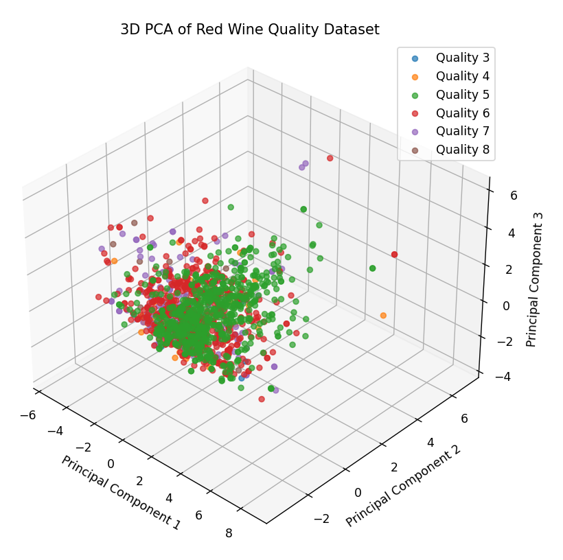 As we can see, the graph presents a cluster of points concentrated around a coordinate, with some points scattered around the cloud of points. These would be the outliers of this dataset:
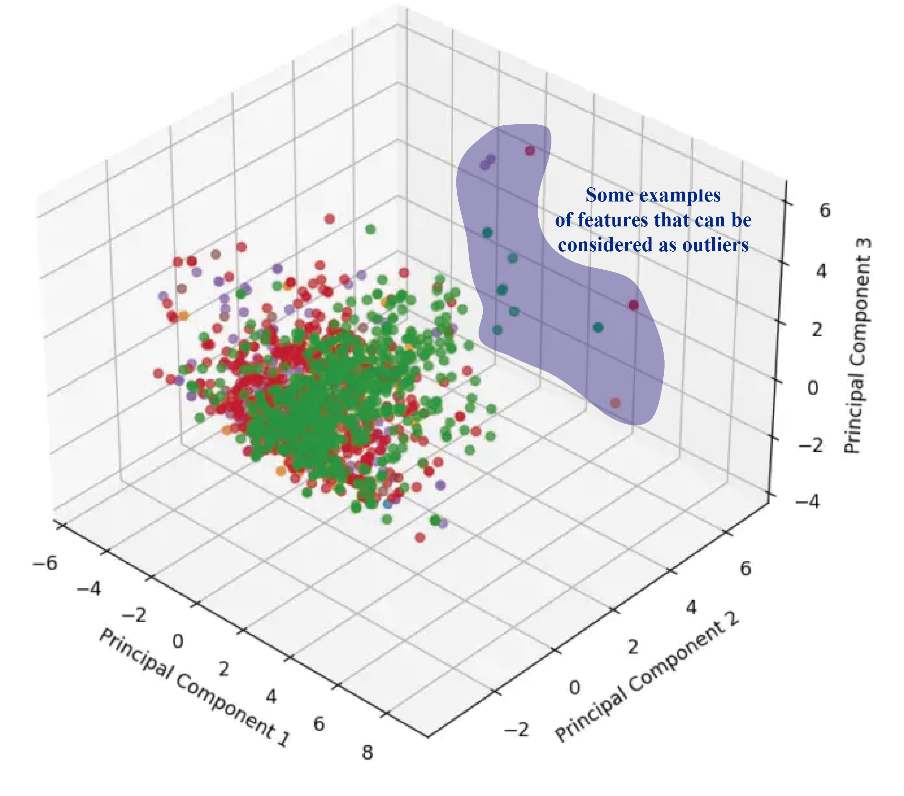
The values shaded in blue are some examples of outliers, although they probably aren’t the only ones. In the shown image, we are identifying them visually, but there are techniques that allow us to identify these values analytically.
In this article, we will delve into the techniques used in Machine Learning and Data Science to identify and remove outliers. We will analyze various strategies and evaluate their impact on the results of the regression and classification algorithms we discussed in our previous publication.
Without further ado, let’s get started.
What are outliers?
In the context of Data Science, an outlier is an observation (or sampling) that deviates significantly and seems distant from the general pattern of a sample. It’s a term frequently used by analysts and data scientists, because if not given the proper attention, it can lead to erroneous and/or imprecise estimates.
The reasons why outliers occur can be varied:
- Data Entry Errors: Human errors, either during data collection, recording, or input, can generate outliers. A simple typographical error or a misinterpretation when entering data can result in values that significantly deviate from the general pattern.
- Measurement Errors: This is a common source of outliers. It occurs when the instrument used for measurement turns out to be faulty. Inadequate calibration or failures in measurement instruments can lead to records that do not reflect reality.
- Natural Outliers: Not all outliers are the product of errors. In some cases, an observation can be genuinely different from the rest. These outliers, called natural, reflect rare events, anomalies, or simply natural variations in a population. For example, in a dataset of heights, an extremely tall or short person could be a natural outlier.
In addition to the reasons behind the presence of outliers, it’s important to mention that they can be classified into two types: Univariate and Multivariate.
- Univariate Outliers: These can be identified by analyzing the distribution of a single variable. The previously discussed example about height is a case of a univariate outlier.
- Multivariate Outliers: Are outliers in an n-dimensional space. They are found when considering combinations of values from different variables. For example, when combining age and salary, we might identify people who, although not outliers in either of the variables separately, are outliers when considered together.
It is crucial for data scientists and analysts to identify and, if necessary, treat these outliers, as their presence can skew the analysis and lead to incorrect conclusions.
How are outliers identified?
- Data Visualization
- Boxplots: Boxplots visualize variability and detect values that fall outside of the “whiskers” and could be considered outliers.
- Histograms: Allow visualization of data distribution and observation of atypical values.
- Scatter plots: Useful for identifying outliers in multivariate datasets.
- Hypothesis Testing: Used to determine if a data point is significantly different from the rest of the sample.
- Z-Score Method: Measures how many standard deviations a data point is from the mean. A very high or very low Z-Score may indicate an outlier.
- Robust Z-Score: An adaptation of the Z-Score that is less sensitive to outliers.
- I.Q.R Method: Based on the difference between the third and first quartile. Data that falls outside of 1.5 times the IQR above the third quartile or below the first quartile might be considered outliers.
- Winsorization Method (Percentile Capping): Limits extreme values to a certain percentile, reducing the impact of outliers without removing them.
- Clustering Methods
- K-Means: Although primarily a clustering algorithm, it can be used to detect outliers by observing data points that are far from the centroids of the clusters.
- DBSCAN: A density-based clustering method that can identify points in low-density regions and consider them as outliers.
- Isolation Forest: Specifically designed for outlier detection, it is based on the idea that outliers are easier to “isolate” than normal points.
- Depth Methods
- Convex Hull: Identifies outliers by observing data points that are not in the convex hull of a dataset.
- Neural Network-Based Methods
- Autoencoders: Are a subclass of neural networks trained to reconstruct their inputs. Data points that the autoencoder reconstructs poorly might be considered outliers.
- Distance-Based Methods:
- K-Nearest Neighbors (K-NN): Data points whose distance to their k closest neighbors exceeds a certain threshold might be considered outliers.
- Regression Methods:
- Linear models: Observing the residuals of a linear model can help identify outliers.
In this post, we will focus on the most commonly used methods to identify outliers, as addressing all of them would be extensive. However, I plan to explore each of the mentioned methods in detail in future posts, which will be linked to this entry.
Outlier Identification through Data Visualization
As we mentioned at the beginning of this post, it is possible to identify outliers in the Red Wine Quality Dataset just by observing the three-dimensional representation of the PCA transformation.
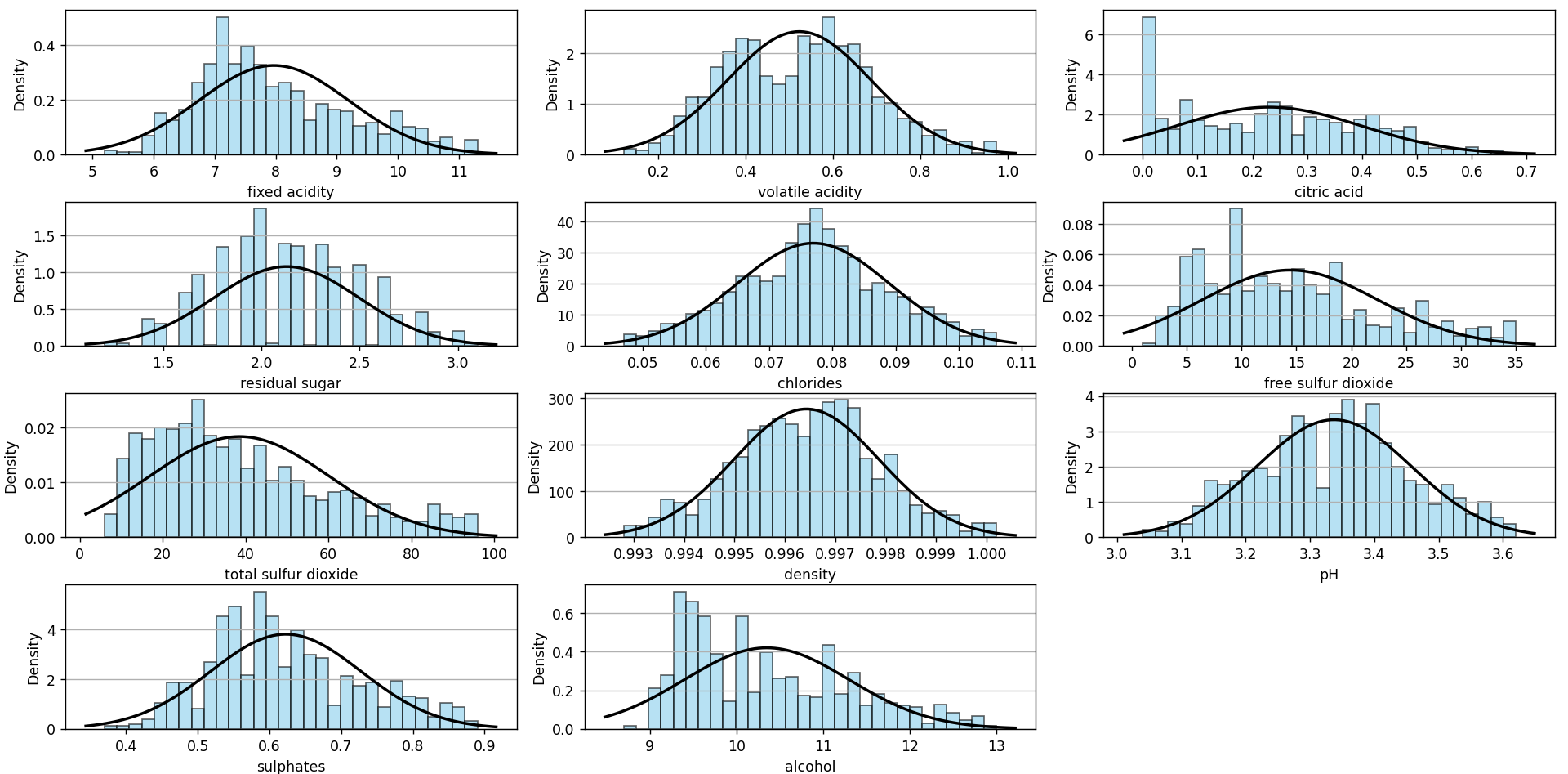
In my post on Red Wine Quality dataset: Regression or Classification?, we also presented histograms for each of the dataset’s features:
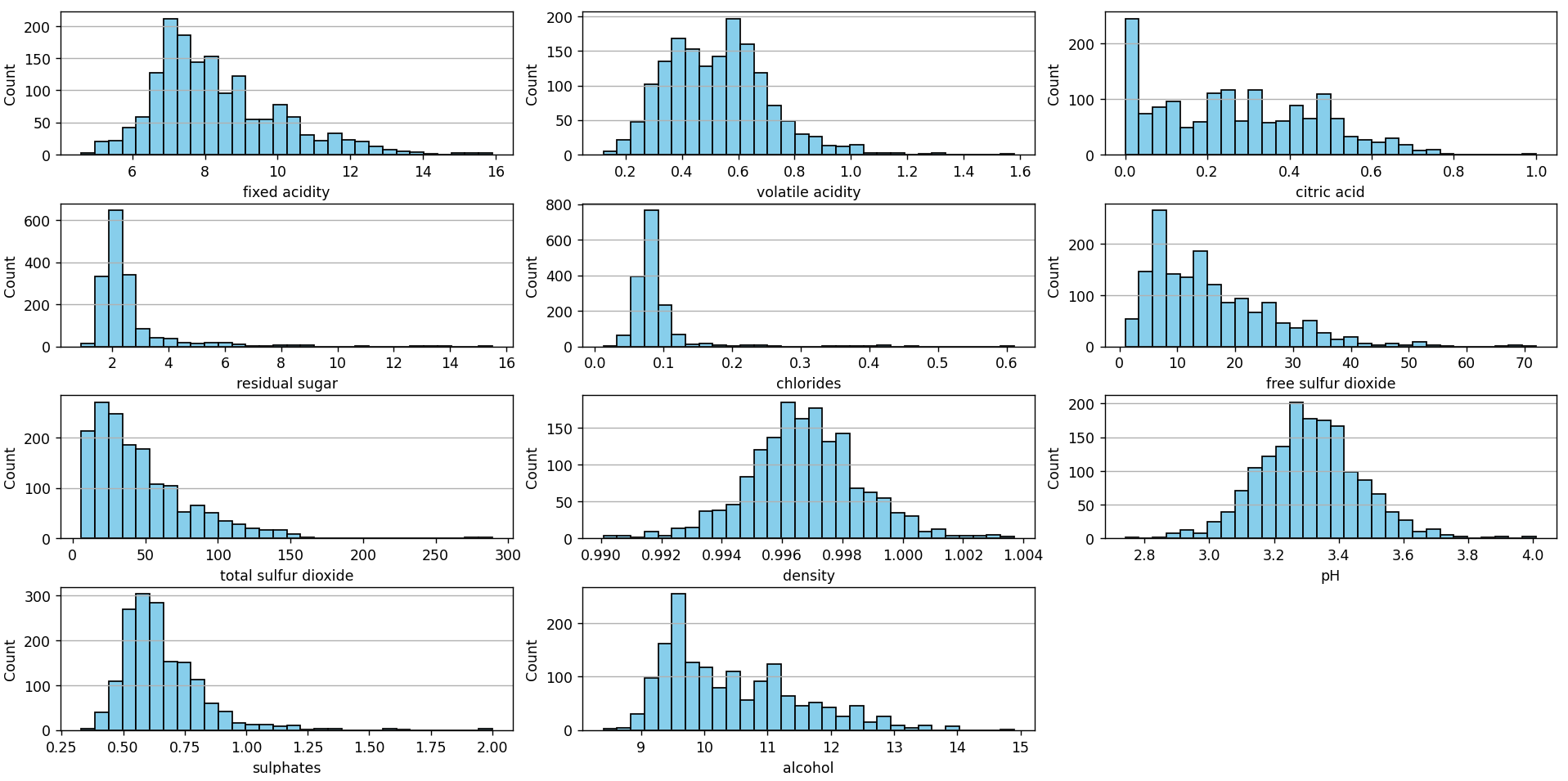
This chart can be constructed using the following Python script available in our Github repository. Visually, several values can be identified that might be considered outliers:
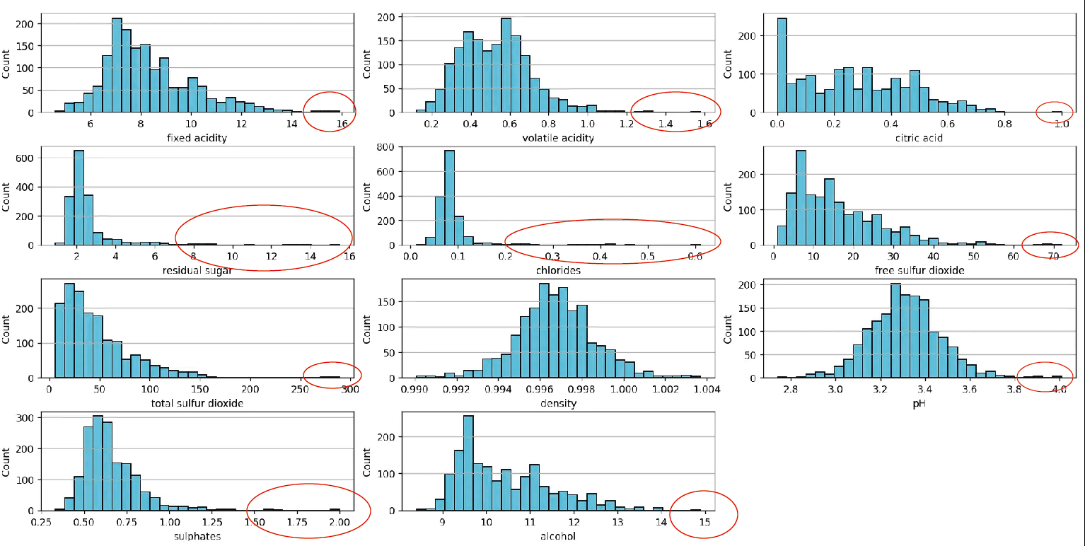
These values clearly stand out from the rest of the data, making them outliers. Another way to visualize them is with a scatter plot, which can be seen in the following image:
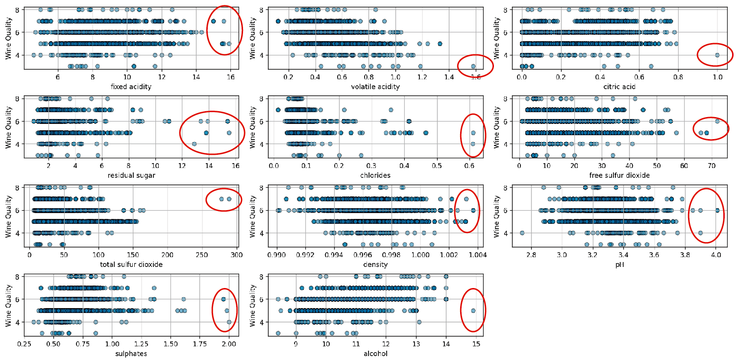
The chart is generated using this script. While the method provides useful visual insight, it is important to note that it relies on purely visual inspection. To accurately determine the presence of outliers, it’s essential to apply specific statistical principles rather than relying solely on visual observation.
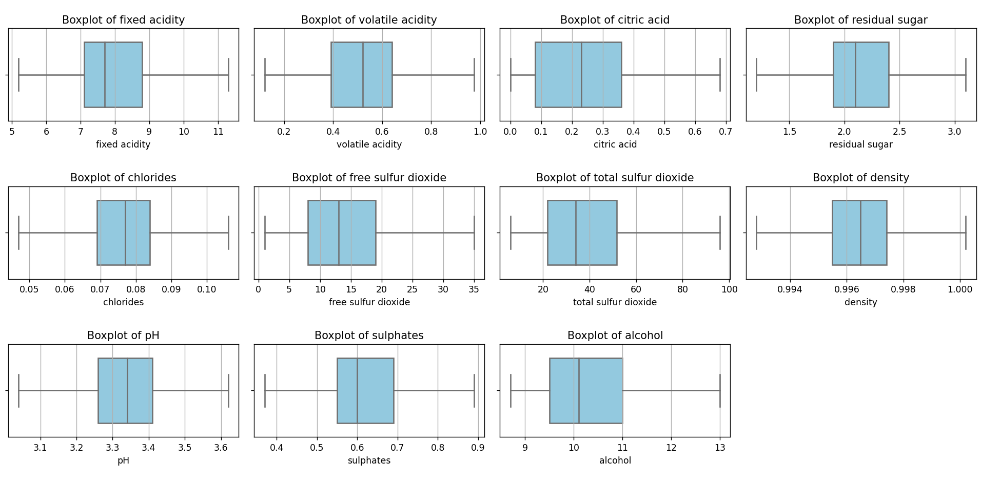
One of the most commonly used techniques to identify and visualize outliers is box plots or box diagrams. These charts are often used in combination with the IQR method. The structure and main features of a box diagram are described below:
- Median (Q2): The line that divides the body of the box diagram represents the median, which is the value that separates the top half from the bottom half of a dataset. It’s a measure of central tendency and provides insight into the central value of the data.
- Quartiles
- First Quartile (Q1): Also known as the lower quartile, it is the value that cuts off the lower 25% of the data. It is represented by the lower edge of the box’s body.
- Third Quartile (Q3): Also known as the upper quartile, it is the value that cuts off the upper 25% of the data. It is represented by the upper edge of the box’s body.
- Interquartile Range (IQR): It’s the difference between the third and the first quartile: IQR=Q3−Q1. It represents the range within which the central half of the data lies.
- Whiskers: These are the lines extending from the box’s body upwards and downwards. Typically, they extend to the most extreme data point within the range defined by Q1−1.5×IQR and Q3+1.5×IQR. The whiskers give us an idea of data dispersion.
- Outliers: These are values that fall outside the range defined by the whiskers. In a box diagram, they’re typically represented as individual points outside the whiskers. These values are unusually high or low compared to the rest of the dataset.
- Body of the Diagram: It’s the rectangle that forms between Q1 and Q3. Its width is, therefore, the IQR. The shape and size of the body, along with the position of the median, give us an idea about the data’s symmetry and dispersion.
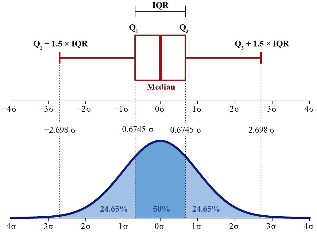
As seen in the image, for a dataset that follows a normal distribution, the boxplot has specific features in relation to standard deviations. The First Quartile (Q1) is situated approximately at a standard deviation of −0.6745 from the mean, while the Third Quartile (Q3) is located near 0.6745 standard deviations from the mean. This encompasses the Interquartile Range (IQR), which covers the central 50% of the data and extends approximately 1.35 standard deviations around the mean.
Moreover, the boxplot’s whiskers, typically defined as 1.5 times the IQR, are positioned around −2.698 and 2.698 standard deviations from the mean. In a perfectly normal distribution, most of the data should lie within these limits, and any value outside this range could be considered an outlier.
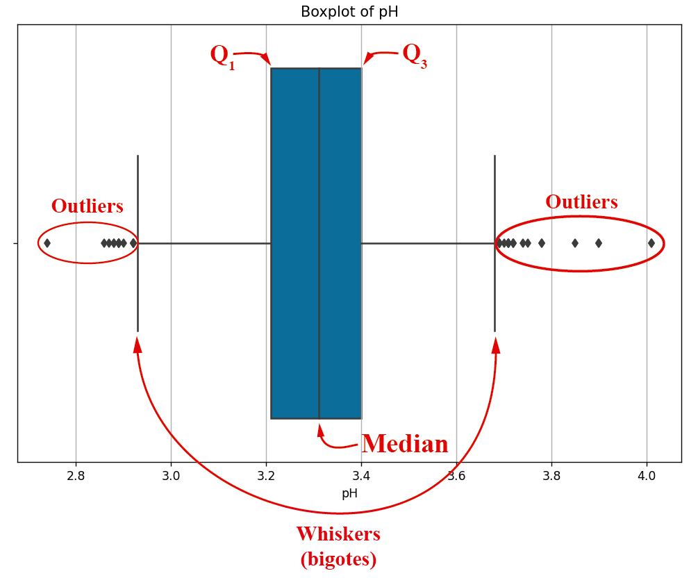
As seen in the image, for the specific case of PH, we have outliers on both the left and the right side of the box diagram. This image can be constructed with this script. A box diagram can also be constructed for each and every one of the dataset’s features:
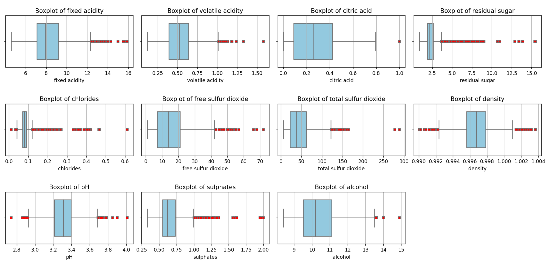
This chart can be generated using this script. As we can see, there are a large number of values considered outliers (in red) under the IQR method criteria. Outliers can be considered a source of contamination in a dataset since they can distort estimates and reduce the accuracy of predictive models. It is crucial to identify and manage these values to ensure the quality and reliability of statistical analysis and Machine Learning models.
Outliers Removal
We have analyzed various methods for outlier detection, although we have primarily focused on the use of the Interquartile Range (IQR), complemented with the box plot for its visualization.
Our next step will be to clean the dataset, removing those values identified as outliers under the IQR criteria. This action will provide us with a new dataset in CSV format. Subsequently, we will apply the previously discussed analysis with the aim of developing a Machine Learning model. The goal is to predict wine quality based on its physicochemical properties.
For this purpose, I’ve created this script. As a result, we obtain a dataset more condensed than the original. The new dataset has 930 records, compared to the original 1599. This means that, after removing the outliers, we have retained approximately 58% of the initial dataset, i.e., around 669 records.
If we rerun the script that renders the box plots, we’ll see the following result:
As we can see, there are no outliers anymore. The same happens if we look at the frequency histograms:
From this perspective, it seems that the density and chlorides are quite close to a normal distribution. I applied the Shapiro-Wilk test, and it turned out negative, but we won’t focus on that right now.
What caught my attention after this analysis is the high proportion of outliers that had to be removed, suggesting that the data might have been influenced by extreme factors or that the nature of wine production is inherently variable. However, it’s essential to remember that the massive removal of outliers could lead to the loss of valuable information. While it’s crucial to ensure that models aren’t biased by these extreme values, it’s also vital to understand the underlying cause of these outliers before making definitive decisions about their removal.
For now, we’ll work with what we have. I’m curious about what will happen when we test Machine Learning algorithms with this dataset. In future publications, I hope to contrast the results of using the IQR with the other methods we previously mentioned.
Testing Machine Learning Algorithms
In my previous post, I introduced a methodology to identify the best classification algorithm using a 10-fold cross validation combined with a gridsearch of classification algorithms. Let’s see how we fare now.
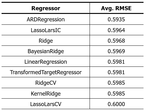
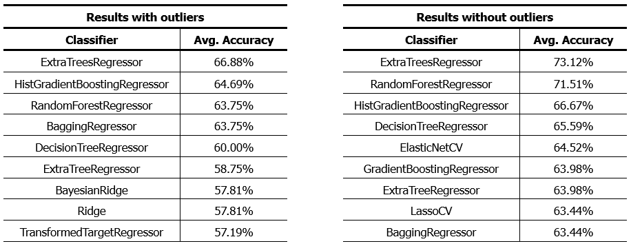
First, I’ll try regression algorithms. Here are the results:
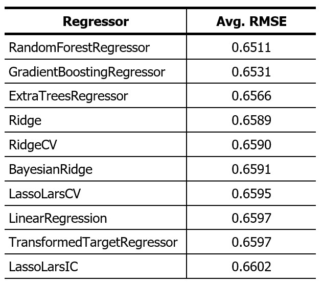
The previous result was this:
 The reduction in RMSE means that the prediction error has decreased. This means that the algorithms presented perform better than those in the previous post, which was expected after removing out-of-range values.
If we decide to round the results of the regression algorithms and evaluate the results as if it were a classification algorithm, we will see the following result:
As we see, the algorithms with the best performance are basically the same but with improved performance. An increase of approximately 6% in the precision of the algorithms. We can achieve these results with this script, simply by selecting one dataset or another.
It’s important to note that, although we’ve managed to improve our models’ accuracy, the removal of outliers also had an impact on the distribution of classes in the dataset. After cleaning, some classes ended up with a very reduced number of samples. This can be problematic, especially when applying classification algorithms, as insufficient representation of certain classes in the dataset can lead to poor model performance in those specific categories.
In essence, the model might not be well-trained to recognize and correctly classify these underrepresented classes. Therefore, before proceeding with classification algorithms, it’s essential to analyze and, if necessary, balance the distribution of classes to ensure robust training and reliable results.
Conclusions
Throughout this article, we addressed the importance of identifying and managing outliers in a dataset. These atypical observations, if not handled properly, can significantly distort analysis and affect the accuracy and reliability of predictive models. Some key conclusions from our analysis include:
-
- Relevance of Outliers: Atypical observations can arise for various reasons, whether due to human errors, instrument measurement failures, or even genuine variations in a population. Identifying the underlying cause of these outliers is crucial before making decisions about their treatment.
- Identification Methods: While there are multiple techniques for identifying outliers, the IQR method and box plots proved to be effective tools in our analysis of the Red Wine Quality Dataset. However, it’s essential to combine visual methods with analytical techniques for precise identification.
- Impact on Modeling: The removal of outliers led to a significant improvement in the accuracy of the regression models applied to the dataset. However, it’s crucial to balance the improvement in accuracy with the potential loss of valuable information.
- Limitations in Classification: Despite the improvements observed in regression, the removal of outliers also impacted the distribution of classes, which could affect the performance of classification algorithms. Underrepresented classes require special attention to ensure proper modeling.
- Exploration of Other Techniques: Although the IQR method provided significant results in this analysis, it’s essential to consider and explore other techniques for identifying and removing outliers. Multiple approaches exist, such as the Z-Score, clustering methods like K-Means and DBSCAN, and neural network-based techniques like Autoencoders. Each technique has its strengths and weaknesses and may be more suitable depending on the nature and structure of the dataset. In future analyses, we’ll examine these options in detail to gain a more comprehensive understanding of how to effectively manage outliers.
In summary, while managing outliers is an essential aspect of data analysis, it’s crucial to approach this process with care and consideration. Each step, from identification to removal or adjustment of outliers, should be done with a clear understanding of the dataset and the overall context of the analysis.
I hope you find this information useful. Any questions or comments can be directed to me through the comment box.


