
Wine has been a cherished beverage for millennia. The quality of wine can vary based on many factors, such as the type of grape, the fermentation process, storage, and others. With the rise of data science, we can use datasets like the Red Wine Quality to gain insights into what makes a wine “good” or “bad”.
On Kaggle, we can find the Red Wine Quality dataset, which includes data related to samples of “Vinho Verde” wine in its red variant, from the north of Portugal. The goal is to model wine quality based on physicochemical tests.
This dataset assigns a numerical value to the quality of the wine, making it suitable for use with regression and classification algorithms. The best approach is likely classification, but in this post, we will explore both options to see the contrasts between each type of algorithm. This post will present the practical part of my previous publication, What is the difference between regression and classification in Machine Learning?.
On the other hand, I am interested in exploring different types of analysis on this dataset in the future, so I will use this post as an introduction for my readers. Without further ado, let’s get started.
Dataset Description
As we mentioned, the dataset in question contains wine samples from the Vinho Verde region, located in the northwest of Portugal. Each entry in this dataset represents a specific wine, detailing both analytical and sensory tests. Here are some key features of the dataset:
- Dataset Composition: It was organized in a way that each entry denotes a specific test, whether analytical or sensory. The final dataset was exported in a single CSV format file.
- Types of Wine: Due to taste differences between red and white wines, the analysis was conducted separately. The dataset has 1,599 examples of red wine.
- Physicochemical Statistics: The study provides detailed statistics for each type of wine, including fixed acidity, volatile acidity, citric acid, residual sugar, chlorides, free and total sulfur dioxide, density, pH, sulfates, and alcohol content. Each attribute is presented with minimum, maximum, and average values for both types of wines.
- Sensory Evaluation: Each wine sample was evaluated by at least three sensory evaluators through blind tastings. These evaluators rated the wine on a scale ranging from 0 (very bad) to 10 (excellent). The final sensory score of each wine is determined by the median of these evaluations.
This dataset provides a comprehensive view of the physicochemical characteristics of wines from the Vinho Verde region and how these characteristics correlate with sensory evaluations conducted by experts in the field.
Dataset Features
Below, I present the features of this dataset:
- Fixed Acidity: Measures the amount of total acids present in the wine, which are essential for the wine’s stability and flavor.
- Volatile Acidity: Represents the amount of acetic acid in the wine, which at high levels can lead to an unpleasant vinegar-like taste.
- Citric Acid: It’s one of the main acids present in the wine, which can add freshness and flavor.
- Residual Sugar: The amount of sugar left after fermentation ends. Wines with more residual sugar are sweeter.
- Chlorides: The amount of salt present in the wine.
- Free Sulfur Dioxide: It’s the portion of sulfur dioxide that, when added to wine, combines with other molecules. It’s used to prevent microbial growth and wine oxidation.
- Total Sulfur Dioxide: It’s the sum of free sulfur dioxide and that which is bound to other molecules in the wine. High levels can make the wine taste burnt.
- Density: Relates the amount of matter in the wine to its volume. It indicates the concentration of compounds in the wine.
- pH: Measures the wine’s acidity or alkalinity on a scale from 0 (very acidic) to 14 (very alkaline). Most wines have a pH between 3-4.
- Sulphates: Are salts or acids that contain sulfur. They can contribute to sulfur dioxide levels, which act as an antimicrobial and antioxidant.
- Alcohol: Represents the volume percentage of alcohol present in the wine.
- Quality (output variable): Based on sensory data, it’s a score between 0 and 10 assigned by sensory evaluators.
These physicochemical features are essential to understand the composition of wine and how each of them can influence the perceived quality of it.
Dataset Exploration
From this point on, I will present some charts and information that will be processed using Python scripts, which are available on our Machine Learning repository on Github.
First, we open the CSV file with the dataset:
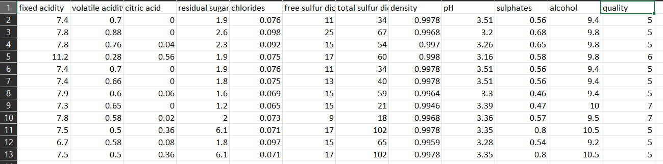
As we can see, the first 11 columns are features, and the twelfth column is the target variable, which we will try to predict. As we mentioned earlier, the dataset contains 1599 records.
Now, we will verify the distribution of the target variable to see how many samples of each type of wine the dataset contains. We can achieve this with the following code:
|
1 2 3 4 5 6 7 8 9 10 11 12 13 14 15 16 17 18 19 20 21 22 23 |
# Required Libraries import pandas as pd import matplotlib.pyplot as plt # Load the dataset df = pd.read_csv('../../../../../datasets/red_wine_quality/dataset.csv') # Visualize Distribution of Target Variable 'quality' using a histogram plt.figure(figsize=(10, 6)) counts, bins, patches = plt.hist(df['quality'], bins=range(1, 11), align='left', rwidth=0.8, color='skyblue', edgecolor='black') # Add labels on top of each bar for count, bin, patch in zip(counts, bins, patches): height = patch.get_height() plt.annotate(f'{int(count)}', xy=(bin, height), xytext=(0, 3), textcoords='offset points', ha='center', va='bottom') plt.title('Distribution of Wine Quality') plt.xlabel('Wine Quality') plt.ylabel('Count') plt.xticks(range(1, 11)) plt.grid(axis='y') plt.show() |
You can find this script at our Github repository, and it produces the following result:
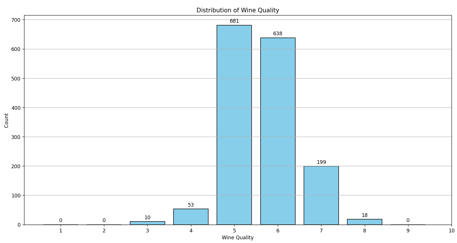
As observed in the graph, there are no wines categorized with the values 0, 1, 2, 9, or 10. The wine classification is concentrated between the values 3 and 8, with the majority (approximately 82%) classified between 5 and 6. This predominance in certain quality categories can complicate the training of classification algorithms.
A Machine Learning model could develop a bias towards these dominant classes, often predicting these simply because they are the most common in the dataset. This imbalance not only biases the model, but it can also result in misleading performance metrics. A high accuracy percentage might simply reflect the correct prediction of the majority class, leaving the minority classes poorly recognized or even ignored.
Because of this, regression algorithms might be more suitable for the development of a predictive model for this dataset. The reason is that, instead of trying to classify the wine into discrete categories, a regression algorithm would try to predict a continuous value for wine quality. This allows for greater flexibility and accuracy in predictions, as it is not limited to fixed categories (classes). Additionally, by treating wine quality as a continuous spectrum rather than discrete categories, the issue of class imbalance is avoided, and a more nuanced representation of wine quality is obtained.
Now, we will use a script similar to the previous one to plot the distribution of the features:
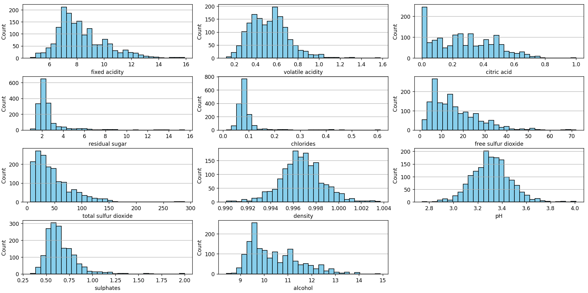
By observing the histograms of each of the features, we can discern the distribution and central tendency of the data for each feature, identifying whether they resemble a normal distribution or if they have left or right skews. These histograms also reveal the dispersion and range of values, allowing for the identification of possible outliers or data concentrations. Additionally, multiple peaks in a histogram may indicate the presence of subgroups or modes within a feature.
Together, these histograms provide a panoramic view of the structure and variability of each feature in the dataset.
Another interesting analysis is the correlation matrix. We can construct this matrix with this script, available in our repository.
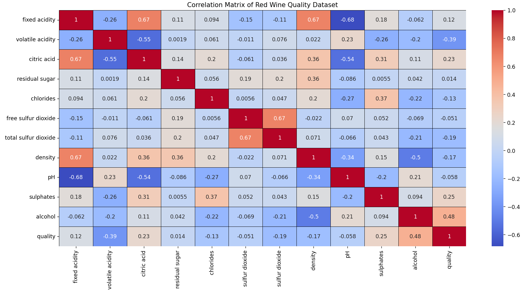
This matrix shows the correlation between variables, where more intense colors represent a stronger correlation.
Strong Correlations
Positive Correlations
- Fixed acidity is positively correlated with citric acid and density.
- There’s a strong positive relationship between free sulfur dioxide and total sulfur dioxide.
Negative Correlations
- There is a negative relationship between fixed acidity and pH.
- Citric acid is negatively correlated with pH.
- Alcohol content is negatively associated with density.
Moderate Correlations
- There is a moderate positive relationship between citric acid and sulfates.
- Chlorides and sulfates are moderately correlated.
- Wines with higher alcohol content tend to have better quality ratings.
- Higher volatile acidity is associated with lower wine quality.
Notable Observations
- Wine quality is positively influenced by its alcohol content and negatively by its volatile acidity.
- As one would expect from the nature of the variables, acidity and pH are inversely related.
Implications for Modeling
- If a predictive model is built, care should be taken when using variables that are highly correlated together, as this can lead to multicollinearity issues.
- Variables most correlated with quality might be important predictors when modeling wine quality.
Another analysis technique often used as part of data preprocessing is the graphical representation of the data through Principal Component Analysis (PCA). PCA is a statistical method that transforms the original, possibly correlated variables, into a new set of uncorrelated variables called principal components. These components are orthogonal to each other and capture the variance of the dataset in decreasing order.
The first principal component captures the greatest possible variance of the dataset, while each subsequent component captures the maximum remaining variance, under the constraint that it is orthogonal to the preceding components. This allows for the reduction of the dataset’s dimensionality, while still retaining the maximum amount of information.
In the context of visualization, PCA is especially useful because it allows us to represent high-dimensional datasets in a two-dimensional or three-dimensional space, facilitating the identification of patterns, groupings, or possible outliers in the data. These visualizations can reveal underlying structures, relationships between groups, or variability within the dataset, which would otherwise be hard to discern in a high-dimensional space.
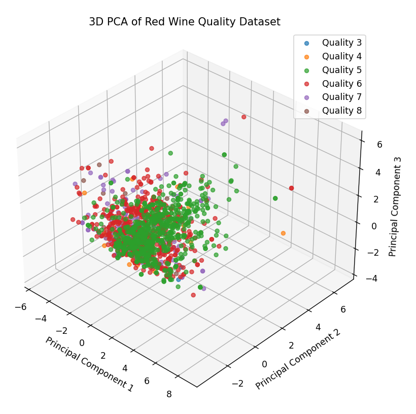
The three-dimensional graph shown below was generated using PCA (Principal Component Analysis) and the source code can be found at this link. In this representation, each point corresponds to a specific wine and its coordinates reflect its physicochemical characteristics. The color of the points indicates the wine’s quality: for example, red points represent wines with a quality rating of 6.
This visualization reveals several interesting features of the dataset. Firstly, there’s a noticeable clustering of points, suggesting that many wine samples share similar physicochemical characteristics. This dense clustering might indicate that most wines in this dataset share certain physicochemical properties.
However, some points significantly deviate from the main group, which we might consider as outliers. These outliers are important to note, as they can affect the efficiency and accuracy of a machine learning model. Depending on the objective and the type of model to be trained, it may be necessary to address these outliers using preprocessing techniques or consider them in the subsequent analysis.
For now, though, we will focus on the main objective of this post: evaluating classification algorithms and regression algorithms on this dataset.
Predictions with Regression Algorithms
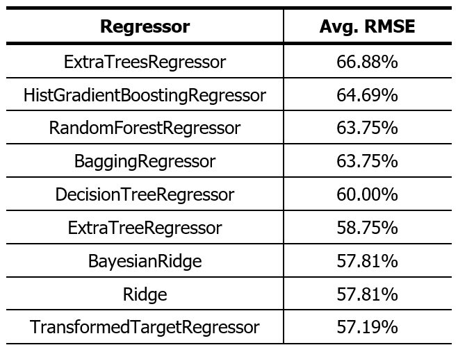
To determine the most appropriate algorithm, I will employ a method that relies on Scikit-Learn’s all_estimators function. This function allows us to access a wide range of regression algorithms, covering between 30 and 40 different models.
Instead of evaluating each model individually, a method is suggested that automatically performs a 10-fold cross-validation on each of them, comparing their performance on the provided dataset. This 10-kfold technique ensures that each sample is used once for validation while the remaining 9 are part of the training set.
To measure the accuracy of each model, the RMSE (Root Mean Squared Error) is used as an evaluation metric. By doing so, the manual selection process is eliminated, and the identification of the most promising regression model for the dataset in question, based on the obtained RMSE value, is expedited. It’s a strategy that combines accuracy and efficiency in the model selection process.
The script is as follows:
|
1 2 3 4 5 6 7 8 9 10 11 12 13 14 15 16 17 18 19 20 21 22 23 24 25 26 27 28 29 30 31 32 33 34 35 36 37 38 39 40 41 42 43 44 45 |
import pandas as pd import numpy as np from sklearn.model_selection import cross_val_score from sklearn.utils import all_estimators import warnings # Convert warnings to errors warnings.simplefilter('error') # This line will treat warnings as errors # Load the dataset df = pd.read_csv('../../../../../datasets/red_wine_quality/dataset.csv') # Check for missing values and handle them if df.isnull().sum().sum() > 0: df.fillna(df.mean(), inplace=True) # Fill missing values with column mean. Adjust this as needed. # Split the data into features (X) and target variable (y) X = df.drop('quality', axis=1) y = df['quality'] # Get all regression estimators estimators = all_estimators(type_filter='regressor') results = {} # Dictionary to store results for name, RegressorClass in estimators: try: # Create a regressor instance model = RegressorClass() # Perform 10-fold cross-validation and compute the average RMSE negative_mses = cross_val_score(model, X, y, cv=10, scoring='neg_mean_squared_error') avg_rmse = np.sqrt(-negative_mses.mean()) results[name] = avg_rmse print(f"{name} Average RMSE: {avg_rmse}") except Exception as e: print(f"Issue with {name}") # This will catch both errors and warnings # Convert results to a DataFrame for easier analysis results_df = pd.DataFrame(list(results.items()), columns=['Regressor', 'Avg RMSE']).sort_values(by='Avg RMSE') # Print the top 10 performers without the index print(results_df.head(10).to_string(index=False)) |
This script is available here. The result of running this code on this dataset is presented in the following table:
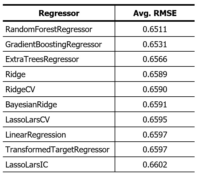
The “Random Forest Regressor” algorithm has proven to have the most outstanding performance. However, it’s relevant to point out that the discrepancy in performance between the top five algorithms is minimal. With this result in mind, we will proceed to use the “Random Forest Regressor”. We will split the dataset following an 80:20 ratio and observe how the algorithm makes predictions on the 20% of data reserved for testing.
The script is as follows:
|
1 2 3 4 5 6 7 8 9 10 11 12 13 14 15 16 17 18 19 20 21 22 23 24 25 26 27 28 29 30 31 32 33 34 35 36 37 |
import pandas as pd from sklearn.model_selection import train_test_split from sklearn.ensemble import RandomForestRegressor from sklearn.metrics import mean_squared_error # Load the dataset df = pd.read_csv('../../../../../datasets/red_wine_quality/dataset.csv') # Check for missing values and handle them if df.isnull().sum().sum() > 0: df.fillna(df.mean(), inplace=True) # Fill missing values with column mean. Adjust this as needed. # Split the data into features (X) and target variable (y) X = df.drop('quality', axis=1) y = df['quality'] # Splitting the dataset into training (80%) and testing (20%) sets X_train, X_test, y_train, y_test = train_test_split(X, y, test_size=0.2) # Initialize the RandomForestRegressor model regr = RandomForestRegressor() # Train the model regr.fit(X_train, y_train) # Test the model sample by sample predictions = [] n=0 for i, row in X_test.iterrows(): n = n+1 predicted_value = float(regr.predict(row.to_frame().T)) predictions.append(predicted_value) print(f"Nº {n} | Expected Value: {y_test.loc[i]} | Predicted Value: {predicted_value}") # Calculate the RMSE for the predictions rmse = mean_squared_error(y_test, predictions, squared=False) print(f"Root Mean Squared Error (RMSE): {rmse}") |
This script, available here, produces the following result:
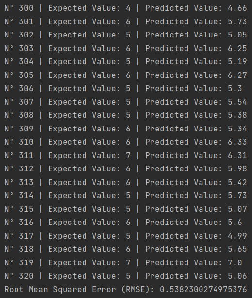
Here we can appreciate the strengths and limitations of using a regression algorithm. Although the algorithm provides an output with decimal values, it doesn’t always accurately predict the exact expected value. For instance:
- For sample 316, the prediction was 5.6 when the actual value was 6.
- For sample 317, it predicted 4.99 when it should have been 5.
- For sample 320, the estimate was 5.06, with the actual value being 5.
A practical solution to this challenge could be to round the predictions to whole numbers. This way, we can mitigate certain errors and evaluate the algorithm’s efficacy in its predictions more clearly.
This script integrates the rounding of the regressor’s predictions. The result doesn’t look very good:
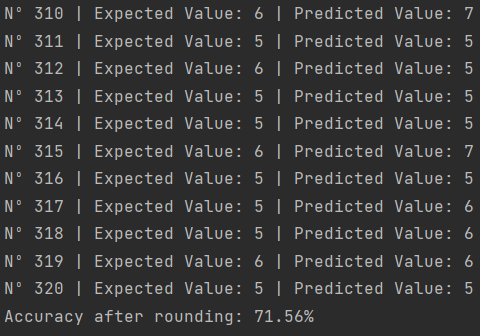
A 71.56% accuracy is a moderate result in the realm of Machine Learning. There are multiple strategies and adjustments we could implement to optimize and increase this figure.
I will run the script that selects regression algorithms again, but this time I will round the result and evaluate the performance of each algorithm as if they were classification algorithms. I will use this script.
The obtained result was:
As we see, the results don’t look very promising. The difference in the accuracy of the Random Forest we tested earlier is because for the 10-fold cross-validation a 9:1 ratio is used and in the previous test, we used 8:2.
In theory, the ExtraTreesRegressor should give us a better result than the 71.56% of the Random Forest, but I don’t expect the difference to be much. Everything seems to indicate that regression algorithms are not good to be used as predictive models on this dataset, or that we lack the use of more advanced data processing techniques to achieve better results.
Predictions with Classification Algorithms
We will now explore the use of classification algorithms on the red wine quality dataset. Since the wine quality in the dataset is a discrete variable (categorized from 3 to 8), it’s logical to think that a classification algorithm might be suitable for this problem. Although we previously mentioned that class imbalance can be a challenge, we will try using classification algorithms to see how well they perform compared to regression algorithms.
Just like we did with regression algorithms, we’ll use Scikit-Learn’s all_estimators function to get a list of all available classification algorithms. Then, we’ll apply a 10-fold cross-validation to each of them to evaluate their performance on the dataset.
The script used for this purpose produced the following result:
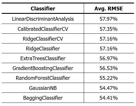
As we can see, the results are not better than those obtained with regression algorithms. This leads us to reconsider some assumptions we might have had at the start of this analysis. It’s possible that the wine quality prediction problem doesn’t fit well with a strictly classification or regression approach using the physicochemical characteristics of the wine as input variables.
As we saw in the three-dimensional representation of the data, the data is closely intertwined, and it’s not possible to differentiate the various classes of the dataset. A deeper analysis will be required to find an algorithm that achieves better results on this dataset.
Possible Explanations and Strategies to Consider
- Dataset Features: Although we have worked with various physicochemical features of the wine, it’s possible that wine quality is influenced by other factors not contemplated in this dataset, such as grape growth conditions, production technique, among others.
- Class Imbalance: As mentioned earlier, most wine samples are rated between 5 and 6. An imbalanced dataset can lead to models that are biased towards the dominant classes. We might consider rebalancing techniques, such as oversampling minority classes or undersampling majority classes.
- Derived Features: We may need to create new features from existing ones or even combine some to get a more meaningful representation of the dataset.
- Hybrid Approaches: We might consider combining classification and regression algorithms or even employing deep learning techniques to address the problem from a different perspective.
- Data Correlation: An exhaustive review of the correlation between features may be essential. Highly correlated features can lead to multicollinearity problems in linear models. Understanding these correlations is crucial to determine if we are introducing new information or redundancy into the model.
Next Steps
In light of these results, there are several strategies we could consider to improve the performance of our models:
- Dive deeper into feature analysis to identify and possibly eliminate those that don’t significantly contribute to wine quality prediction.
- Experiment with feature engineering techniques to create new features that might be more informative.
- Use regularization techniques to prevent overfitting and improve model generalization on unseen data.
- Consider using neural networks and Deep Learning, which might be able to capture more complex patterns in the data.
Conclusion
In this post, we have analyzed in detail the Red Wine Quality Dataset, which showcases the physicochemical characteristics of a specific wine variety and its relation to its quality.
Despite the efforts made and techniques applied, the current classification and regression algorithms haven’t shown optimal performance. This could be due to various factors, from the intertwined nature of the data, through possible class imbalances, to correlation among the features. However, it’s important to remember that each dataset presents unique challenges and often requires a tailored approach to extract the most valuable information.
As data scientists, our mission doesn’t stop at obstacles. In future deliveries, we will embark on a deeper exploration, presenting and testing different techniques and approaches with this dataset. Our goal is to improve algorithm performance and, in the process, provide the community with tools and knowledge that can be applied in similar contexts.
Data science is a journey of continuous learning and adaptation, and we hope you will join us in our upcoming posts on this topic.


